Colored Stone Darkness & Brightness
August 9, 2018
Part 3 of 5 in the series: Value Factors, Design, and Cut Quality of Colored Gemstones (Non-Diamond)
Originally published in GemGuide in 2016, this comprehensive series examines the quality factors that influence the value of colored gemstones, with a specific emphasis on the role cut quality plays in determining the value of faceted gems. GIA researcher and cut expert, Al Gilbertson, examines the elements of cutting, investigates the choices and tradeoffs a cutter makes and why, and provides guidelines for assessing various aspects of cut quality for colored gemstones.
This web version of the original series is divided into five separate articles and reflects minor stylistic edits to the original.
About the images: Wireframes or depictions of facet arrangements (such as the left side of Fig. 3-09) are from scans of real gems so as to illustrate aspects of gem cutting. Face-up patterns (such as the right side of Fig. 3-09) were made using the program DiamCalc; adjustments were made to the refractive index to represent the gem material being demonstrated. DiamCalc does not show double refraction.
A Cutter’s Tradeoffs
Before discussing how the trade assesses relative value of colored gems, it is important to realize that you will often see examples where the cutter had to choose between various tradeoffs. For example, a cutter has a very thin piece of rough that happens to be very rare. Do they cut several small gems from the rough or do they cut a single, larger gem that will be quite shallow and badly windowed? In many cases the resulting value in either scenario above will be about the same. However, in some cases, one or the other may be significantly more valuable. Perhaps if cutting that rough into a single gem will result in the largest-cut gem of that species, the cutter may opt for cutting the single gem. There are many tradeoffs to be considered.
Darkness—The Good, the Bad, and Its Causes
Extinction is considered by many in the jewelry trade to be the dark areas seen when looking at the gem face-up. That’s not quite enough information. Extinction is only one of four different causes of the dark or black portions of the pattern observed in a gem.
- Absorption. The material is very dark (see Fig. 3-01) and light just can’t get through it. Virtually the entire spectrum of the visible light passing through the gem is absorbed. This type of darkness is bad.
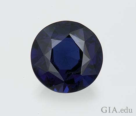 Fig. 3-01. The spectrum of visible light is almost completely absorbed in this very dark spinel. Photo: Robert Weldon/GIA
 Fig. 3-02. This chart illustrates the effect of crown and pavilion angles on a gem’s ability to reflect light. Parts of this figure were borrowed from Richard Hughes, Gemological Digest 1988, Vol. 2, No. 1&2, pp. 10-15. Illustration: Al Gilbertson/GIA
 - Windowing. Light passes through the gem and is not bounced back in any direction by the pavilion facets to the observer. The effect is that you are seeing though the gem. This creates gray and dull areas in the middle of the gem (see Fig. 3-02), which are negative factors. We cover windowing in much greater detail later in this article.
- Extinction. Light goes into the gem and makes at least one bounce off a pavilion facet, but is not returned back to the observer through the crown. The observer sees a reflection from that steep facet that is coming from a low angle outside the gem. Compared to the adjacent facets that are reflecting from a bright light source (highly illuminated area), the strong contrast causes the low-angle reflection to be so dark that it is near-black or extinguished. You aren’t seeing through the gem, even though you should be seeing a reflection from that facet of something outside the gem; all that is seen is darkness. This is true extinction and is the result of steep angles on the pavilion (see Fig. 3-02).
The steeper the pavilion, the more extreme the extinction. An accomplished cutter can use extinction to their advantage. For instance, cutting a pale material (kunzite or citrine) with a deep pavilion not only allows stronger absorption of light that travels a longer path through the gem (this improves some gems only slightly), but also renders the gem’s color more distinct. The resulting extinction seems to increase the saturation of the color through contrast (more on this later). Purposely choosing angles that create extinction gives the illusion of a more saturated gem. Conversely, creating angles that produce higher light return with minimal extinction create the illusion of a less saturated gem. - Observer and object reflection. Observers usually hold a gem 8 to 20 inches away from their eyes. Light is typically coming over their shoulders, entering the gem, and returned back for them to see. The observer is reflected as dark compared to the light source around them (see Fig. 3-03). This should be thought of as observer and object reflection (Harding, 1975; Gems & Gemology Fall 1975; and Gilbertson, 2013).
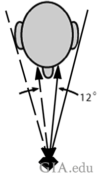 Fig. 3-03. An observer’s reflection influences the perception of darkness in a gem. Illustration: Bruce Harding/GIA
This type of darkness can be good if in moderation. The contrast pattern we see in many gems is a result of this reflection of the observer’s head and upper torso (see Fig. 3-04). Observer reflection is important; the resulting contrast pattern affects the impression of brightness or dullness in a gem.
 Fig. 3-04. The dark portions of contrast patterns in gems are often the reflections of the observer’s head and torso. Illustration: Al Gilbertson/GIA
To better understand observer reflection, consider what a faceted gem might look like in a totally diffuse white-lit environment. If the gem were not reflecting anything but white light, it would not have any contrast (see Box A in Fig. 3-05). If you were to cover your face and shoulders with a fluorescent red mask (see Box B in Fig. 3-05) and look at the gem in that diffused white light-only environment, this is what you would see (see Box C in Fig. 3-05). If you were closer to the gem, there would be more of the red reflected throughout the gem (see Box D in Fig. 3-05). If the room was not lit and the observer’s face had a light shining on it, the result would be just the opposite, and the gem would be primarily dark with the observer’s face reflecting as a bright area. Fig. 3-05. An example of how an observer influences the contrast patterns of light and dark in a gem. Box A: a gem in fully diffused white light. Box B: a hypothetical observer covered with a fluorescent red mask. Box C: the observer’s reflection in red on the gem. Box D: as the observer moves closer, the stronger and darker his reflection. Illustration: Al Gilbertson/GIA.
Another example of observer reflection that is rather obvious is the dark bowtie. Figure 3-02 shows an example of how the bowtie (at 12 and 6 o’clock) in the sample gem is changed as the pavilion angles change. It is simply a result of observer reflection which occurs for a narrow range of angles on the pavilion.
The Influence of Contrast on a Gem’s Appeal
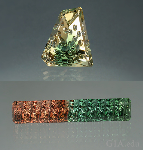
The contrast pattern seen in a gem, whether from observer reflection or extinction, affects the appearance of color, brightness, and appeal. Contrast pattern is a result of the facet placement (angles and position). More traditional cutting styles deemphasize the contrast pattern, and make the apparent color more uniform and softer. However, strong contrast, best exemplified by the dark accent areas of fantasy-style cutting, creates a stronger impression of the color and a more dynamic appearance (see Fig. 3-06).
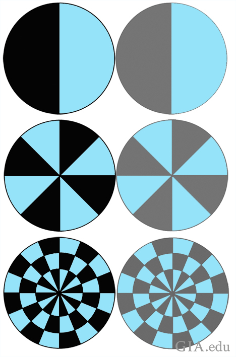
The illustration below (see Fig. 3-07) demonstrates the effect of contrast on color perception. The blue color is the same for all the circles pictured. However, the circles on the left have stronger contrast than the circles on the right. The overall impression of the blue on the right is weakened due to the lesser contrast with the gray. This illustrates that strong contrast is more appealing, resulting in more vibrant colors.
Unfortunately, the strong contrast in many designs may also render the impression of color as being much darker and even too dark when used with gem material that is already strongly saturated.
Windowing and Depth
As mentioned above, strong contrast can strengthen the impression and uniformity of color. Weak contrast does the opposite. Here are three light pink gems (see Fig. 3-08), each with a windowed area under the table. As the window gets larger, the color in the middle of the gem weakens and becomes less uniform.
A CUTTER’S TRADEOFF: A cutter had to decide whether to finish with a larger diameter and more weight (and a larger window), or if cutting a smaller diameter gem that didn’t window would yield as much value. In Figure 3-02 a cutter may choose to use a slightly shallow pavilion (57%) because the saturation of color is strong enough that the windowing will minimally impact the face-up appearance and value. This may also mean that they can recover a higher yield from the rough, and the final value of the gem will be higher than if they were to cut a smaller diameter with a 62% pavilion depth. Others may feel that the depth has to be at least 62% to achieve a prime color and that is more important.
A gem’s refractive index (RI) determines the ideal depth to avoid windowing. Refractive index is a measurement of how far a particular gem material can bend light. The higher the RI, the less deep the gem needs to be cut to avoid windowing. That’s why well-cut diamonds (RI 2.417) can be cut much shallower and do not window even when tilted.
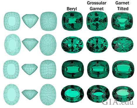
The examples in Figure 3-09 are beryl, grossular garnet, and grossular garnet tilted 15 degrees, whose depths get a little shallower as you move from top to bottom in the illustration. The diagrams on the left reflect the exact proportions used for the gem materials displayed on the right—jewelers tend to avoid gems as deep as the first two rows. The difference in face-up appearance is because of the refractive indices of the gems.
In the illustration there is no windowing for garnet, until tilted for the steep proportions or until the proportions are shallower. For beryl, the degree of windowing is minimized in the two deeper stones. The first one is not deep enough to avoid windowing. Note how the placement of facets in the oval-shaped beryl (second from the top) closes in to reduce the window. If the cutter were to work with quartz (RI 1.54, which is lower than beryl and garnet), the gem would require deeper proportions than any of the diagrams shown to avoid windowing.
Besides not reflecting light back up to the observer, the disadvantage of a window means that whatever is behind the gem affects the color. When a windowed gem is set in a pendant, the skin color or the fabric it rests on affects the apparent color. This is more obvious in lightly colored gems. Note that when there is a strong saturation of color, small windows are less noticeable and less distracting and can be beneficial by slightly weakening an overly saturated color.
Brilliance and Depth (Shallow, Deep, and Acceptable)
In the jewelry trade, it is not uncommon to use the term ‘brilliance,’ but not everyone means the same thing when they use it. Because of that confusion, GIA started using the term ‘brightness’ when it released information in 2004 about its upcoming cut-grading system for diamonds. GIA’s definition for brightness is, “The appearance, or extent, of internal and external reflections of "white" light seen in a polished diamond when it is viewed face-up.”
For some, brilliance refers to the amount of ‘life’ a gem has. Does it sparkle when you rock and tilt it? Does the light dance around in the gem? For others, the not-so-technical term brilliance may not refer to the white light reflected from within the gem, but to colored light. Color is still king and in a well-cut gem, most of the light that returns needs to be saturated with color. A poorly cut colored gem will have areas of dullness and weakened color and will thus lack brilliance.
I’m going to use the term brightness, but not in the sense that GIA meant for diamonds as it doesn’t really work with colored gems. Brightness needs to include the color saturation when talking about colored gems. Unfortunately good brightness depends upon good color depth to get that desired saturation. If we want to cut a gem that is uniform in color, bright white light reflected from within the gem can wash out that color.
Richard Hughes, author and one of the world’s foremost experts on ruby and sapphire, points out that in cutting colored gems, “Generally, the pavilion facets closest to the girdle are cut too steep while those at the culet are too shallow; often only those in between are cut at the proper angle. This results in three distinct zones: extinction near girdle, windows near the culet and brilliance in-between…” Figure 3-02 demonstrates this in general terms and it is evident that cutters should avoid faceting gems too shallow or too deep. But what is too deep or too shallow?
A CUTTER’S TRADEOFF: Many jewelers shy away from gems with deep proportions because they don’t fit their view of what looks good in a piece of jewelry, even if those gems are not windowed. The jeweler looks at the profile of the gem and decides it is too deep. The jeweler will probably never find a gem shallow enough without a window. In this way the jeweler influences the cutter, and even some of the market prices since the cutter will have a harder time selling the deeper gem even though the color is more even and faces up better.
Experimentation: Designer Cuts and Mixed Cut Styles
A CUTTER’S TRADEOFF: Experimentation. Designers often try to think outside of the box and experiment with new ideas of contrast and pattern in a gem. A designer who utilizes windowing may be trying to create a design that is unique and striking, even if the color is uneven or sometimes weaker. Additionally, some designs focus on returning bright light from under the table to the observer, while the color can be weakened by the excessive bright light return with little contrast. That brightness may have been part of the intended pattern. Ultimately, the success of their experimentation lies in the acceptance of sales of that final “look” that they gave the gem.
The discussion of brilliance above has focused on more traditional cutting styles. Designer cuts bring a different approach, where scintillation and apparent brightness are the primary goals much like in diamond cutting, and the emphasis on evenness of color and saturation takes a back seat.
Within this style of cutting, windowing is frowned upon and the face-up pattern is very important. The Spirit Sun, developed in the early 1980s (see Fig. 3-11), exemplifies this concept. All of the facets are designed to reflect white light back to the observer resulting in very little contrast pattern (this also causes the slight color zoning of this pale citrine to become more visible face-up).
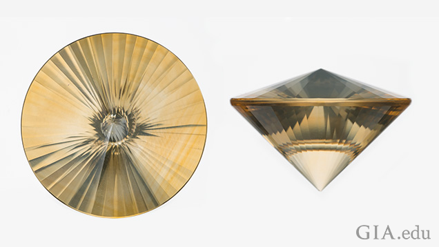
The concept of brightness and what gives us the impression of brightness is not just a matter of how much light is sent out of the gem for us to see (the Spirit Sun in Figure 3-11 sends back most of the light going into it). It is also a question of perceived pattern. Cognitive scientists (they study our vision and how we perceive things) tell us that the stimuli our eyes and brain (our visual system or VIS) process are not simple. Our VIS also works with all of the available cues; for instance we perceive that a gem generates light from within itself in a pattern that changes as the gem moves. This pattern is created by the interaction of light with the faceting design of the gemstone. That pattern affects our perception of brightness.
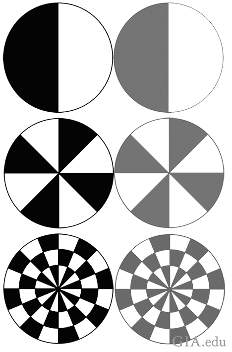
Each of the circles in Fig. 3-12 is 50% dark and 50% white light (by surface area). “The checkered pattern of the bottom left circle makes it perhaps the most visually interesting. If a gem were able to return 100% of the light (all white), and no dark areas were visible, it would measure brighter than a stone with dark areas of contrast—but its appearance would be far less appealing. For instance, the right column in Fig. 3-07 (above) seems duller than the left due to weaker contrast. These images show that while good light return is an important aspect of ‘brilliance,’ contrast is a critical factor in face-up brightness. Obviously, there comes a point when too much darkness or a poor distribution of darkness is less pleasing.” (Gilbertson, 2013)
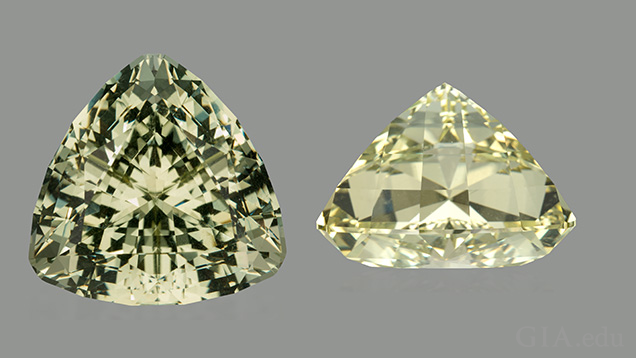
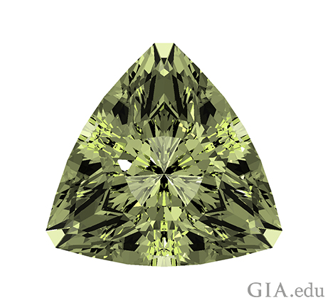
An example of perhaps too much added pattern darkness can be seen in the yellow triangular-cut beryl (see Fig. 3-13). In a pale gem, this adds to the impression of darker color and can help the gem’s salability. Similar to diamond cutters, some colored gem designers work to create strong contrast within a gem. This strong contrast brings about different, interesting patterns. Some designers create more subtle designs with less contrast. Both types can have their appeal. In a saturated color, adding a lot of dark contrast will make the gem overly dark (see Fig. 3-14). When the cutter is sensitive to what the pattern creates, it can enhance the gem. When the cutter fails in their choice of design, the gem’s color is weakened (made too dark by too much strong contrast or too light by weak or non-existent contrast such as the Spirit Sun).
Cut designers like to experiment with variations of ‘brilliant’ styles of cutting which have been welcomed in the diamond trade, such as the radiant cut. Yet some in the colored stone industry don’t care for designer-cut sapphires, rubies, or other colored gems because they feel the older styles of cutting bring out the color better (and generally make the color more even). This is another TRADEOFF that centers on the term ‘brilliance.’
Many designers carefully modify facet arrangements using computer programs, such as GemCad and GemRay, to see how their plans will impact their design (Fig. 3-15 is from GemRay). Some years back, an effort was made to collect GemCad generated diagrams (cutting plans) into a database. At that time, there were over 4,000 of these diagrams (some copyright protected). Since then more diagrams have come forward, and there is now an on-line repository for many published designs.
We’ve talked about concepts that influence our perception of brightness. Now let’s talk about evaluating the overall impact of the gem’s cutting in reference to brightness. Remember that good color brightness depends upon color depth. Begin by picking up the finished gem. As you tilt and move it, most of the gem should return good brightness (with good color). Gems with 50% brightness are still considered appealing in the jewelry trade. However, gemstones with too many dark areas (from deep proportions) or windowing (from shallow proportions), and less colored brightness are not as valuable. Less brightness means less value. Uneven patterns also start to have greater impact as cut quality worsens.
Remember that color is king, so impressions of a bright vivid color can help improve value. Too much brightness or darkness can weaken the color, so the cutter is trying to achieve a balance of just the right amount of brightness and darkness to get the impression of the best color saturation.
UP NEXT: Part 4: "Some Factors that Interact to Affect Value” digs deeper into cutters’ choices and explores additional factors used in the trade to assess relative value.
Al Gilbertson is the Project Manager, Cut Research at the Gemological Institute of America Laboratory Carlsbad. Prior to joining GIA, Gilbertson served on the the American Gem Society (AGS) Cut Task Force, where he made significant contributions, including developing a patent which was acquired by AGS as the foundation of their ASET technology for cut grading. Hired by GIA in 2000, he became part of the research team that created the GIA cut grading system for round brilliant diamonds. Gilbertson is also the author of American Cut—The First 100 Years.
Thanks to Wayne Emery (The Gemcutter), Brooke Goedert (Sr. Research Data Specialist, GIA Carlsbad), Josh Hall (Vice President of Pala International, Inc.), Dalan Hargrave (Gemstarz), Richard Hughes (Lotus Gemology), Stephen Kotlowski (Uniquely K Custom Gems), Andy Lucas (Manager, Field Gemology-Education, Content Strategy-Gemology, GIA Carlsbad), and Nathan Renfro (Analytical Manager, Identification, GIA Carlsbad) for reviewing this article and providing valuable input.
Parts one and two of this series appeared in GemGuide, January/February 2016, Vol. 35, Issue 1; parts three and four in March/April 2016, Vol. 35, Issue 2; part five in May/June 2016, Vol. 35, Issue 3. Note that the article does not use the term faceted in the title. However, the major thrust of this series is faceted gems.
Gemworld International, Inc., 2640 Patriot Blvd, Suite 240, Glenview, IL 60026-8075, www.gemguide.com
© 2016 Gemworld International, Inc. All rights reserved. Permission granted for GIA to publish this at GIA.edu.


